Today, the author Lillian MacKenzie Rhine stops by on her blog tour for her newly released vampire romance titled Winter’s Island. Please enjoy a blurb about the 5-star read:
Cay Winters is an impressionable free spirit from Los Angeles, California. Losing her mother at a very youthful age has given her a drive to live life a certain way. Her aunt Lulu and cousin Malcolm welcome her into their hearts, taking care of all of the things needed by a motherless child. Being an artist has taken her to a lot of interesting places; but when the chance to live in Saint Thomas, Virgin Islands appears, she is eager to take it.
Once there, she is overwhelmed by the beauty and the mystique of the Virgin Islands. The food, the beaches, the attractions are amazing, but William Gatling is the best part. He takes on the task of teaching Cay how to love the right way. The only problem is the secret that he holds from her. A revelation that could rip her from his heart; or, worse yet, end her life.
The two lovers spend so much effort trying to fight their inner demons that they cannot see the true devils that are sitting in front of their faces. Once Cay fights her battles within, she can finally win the war outside. Once William accepts the truth, he can see the light.
Lillian is also the creator of the cover art for all her pieces, so today she will discuss what went into creating this beautiful book cover.
***
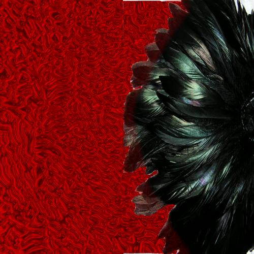
First I want to mention that all the layers of this cover and all my covers are used with free stock images since I am a starving artist; but to get started, I had a totally different vision for my cover than the finished product. My thoughts were to have the back of a woman or a silhouette of a woman from behind with a nice background texture. As some may know, when it comes to free stock images...good stocks are rare and nice female stocks are non-existent. I knew I also wanted something on the cover that represented the island of Saint Thomas, VI as well. Not being able to find a free image, I input a placeholder image while I searched high and low for the perfect female (at that point I was willing to pay for a stock photo as well). Below is the first cover I created minus the female placeholder:
The plan was to use the feathers as a representation of a Carnival headdress and the background to simulate spilled blood. (My cover I created for my first piece was also red, so I got a few comments on that.) I had a difficult time deciding where I actually wanted to place the feathers, then somehow I ended shrinking the feathers and duplicating for a showgirl type feel; meanwhile, I steadily sought out a stock image of a female or feminine body part.
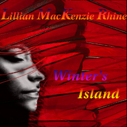
One day, I was blindly searching through my favorite stock image site when I stumbled upon an image of an abstract female profile. It was perfect for the cover; however, it just did not go with the black feathers that I had chosen in the image above; so with that knowledge, I set out to find the best background texture for the female face.

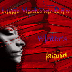
The above image was my final piece of combined stocks and editing techniques. I was still able to use the feather and crimson concept as I wished in the beginning. All I had to do was add font. During my observations of book covers that I believed were phenomenal representations and those that were horrendous, I realized that either way it goes, font is the key element that can make or break a great cover. I have always loved to use color in my fonts which in some cases can be very bad...it was in my case as well. I laugh on it right now, but it is important to have a network small or large of viewers that will give you honest opinions on everything you put out. There are actual sites out there that bash and poke fun at terrible covers, so be weary of those. Without further ado, my colorful fonts:
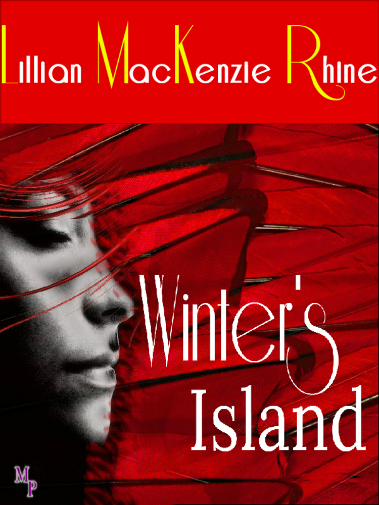
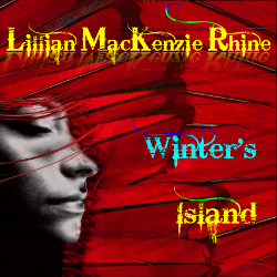
The final cover was the one I chose to be the face of Winter’s Island, until I dove deeper into my observations of book covers. Playing around with plain white font and different fonts, I fell in love with the cover I have today. The lettering allocated to the author name section was difficult to see so I had to play around with the size and add in just a smidge of yellow to make it stand out.
***
This was a very informative posting, and I thank you for sharing with all and any who plan on creating their own images.
To read Lillian’s vampire romance, Winter’s Island, please click the amazon links below. To view her past and future works, visit her blog and Facebook page also found below.
AMAZON (US): http://www.amazon.com/Winters-Island-ebook/dp/B00EWAZECS/ref=sr_1_2?s=books&ie=UTF8&qid=1379128416&sr=1-2
TWITTER: www.twitter.com/LillyMacRhine
No comments:
Post a Comment
Thank you very much for your comment.